Welcome to today’s tutorial where we will talk about buttons with icons in Flutter. As the slogan of Flutter says “It’s all widgets”, its no exception in this case. There are multiple ways of making and incorporating a button with icons in Flutter. We will start with the most obvious one which is the IconButton widget.
If you are interested in Flutter video tutorials, check this playlist: Flutter Video Tutorials. Also, there is a large collection of code examples if you check Flutter tutorials page.
IconButton Widget Example
IconButton is a widget that as the name suggests is a button that has an icon as an identifier. By default, IconButton can not be a parent widget. The most common use for the IconButton would be in AppBar actions or BottomBarNavigation.
To create a very simple IconButton you can use the following code snippet.
IconButton(
          onPressed: () {
            // You enter here what you want the button to do once the user interacts with it
          },
          icon: Icon(
            Icons.email,
            color: Colors.white,
          ),
          iconSize: 20.0,
        ),
Ink Widget with an IconButton
IconButton by default does not support a background color or any other background decorations for that matter. However, there is a way of implementing a background by using the Ink widget like in the example below.
Ink(
       decoration: const ShapeDecoration(
         color: Colors.lightBlue,
         shape: CircleBorder(),
       ),
       child: IconButton(
         onPressed: () {
           // You enter here what you want the button to do once the user interacts with it
         },
         icon: Icon(
           Icons.email,
           color: Colors.white,
         ),
         iconSize: 20.0,
       ), Icon
     ), // Ink
To see how IconButton is used with an Ink widget in a very simple app have a look at the code snippet below.
import 'package:flutter/material.dart';

void main() {
  runApp(MyApp());
}

class MyApp extends StatelessWidget {
  // This widget is the root of your application.
  @override
  Widget build(BuildContext context) {
    return MaterialApp(
      title: 'Buttons with Icons',
      theme: ThemeData(
        primarySwatch: Colors.blue,
      ),
      home: MyHomePage(title: 'Buttons with Icon'),
    );
  }
}

class MyHomePage extends StatefulWidget {
  MyHomePage({Key key, this.title}) : super(key: key);
  final String title;

  @override
  _MyHomePageState createState() => _MyHomePageState();
}

class _MyHomePageState extends State<MyHomePage> {
  @override
  Widget build(BuildContext context) {
    return Scaffold(
      appBar: AppBar(
        title: Text(widget.title),
      ),
      body: Center(
        child: Column(
          mainAxisAlignment: MainAxisAlignment.center,
          children: <Widget>[
            Ink(
              decoration: const ShapeDecoration(
                color: Colors.lightBlue,
                shape: CircleBorder(),
              ),
              child: IconButton(
                onPressed: () {
                  //  You enter here what you want the button to do once the user interacts with it
                },
                icon: Icon(
                  Icons.email,
                  color: Colors.white,
                ),
                iconSize: 20.0,
              ),
            ),
          ],
        ),
      ),

    );
  }
}
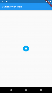
If you run the above code example in Android studio, your app will look like the one on the image below.
FlatButton with an Icon
All button widgets can have an icon as a child widget thus creating the option to make your own custom IconButton. My personal favorite way of implementing and using an icon button is creating one like in the example given below.
We will use a regular FlatButton and we will give it a child of Column that will contain some text and an Icon like the example given below.
FlatButton(
        textColor: Colors.white,
        height: 60.0,
        color: Colors.cyan,
        onPressed: () {},
        child: Column(
          mainAxisAlignment: MainAxisAlignment.center,
          children: [
            Padding(
              padding: const EdgeInsets.all(8.0),
              child: Icon(
                Icons.email,
                color: Colors.white,
              ),
            ),
            Text(
              'EMAIL',
            )
          ],
        ),
      ),
To see how FlatButton is used with an Icon widget in a very simple app have a look at the code snippet below.
import 'package:flutter/material.dart';

void main() {
  runApp(MyApp());
}

class MyApp extends StatelessWidget {
  // This widget is the root of your application.
  @override
  Widget build(BuildContext context) {
    return MaterialApp(
      title: 'Buttons With Icons',
      theme: ThemeData(
        primarySwatch: Colors.blue,
      ),
      home: MyHomePage(title: 'Buttons with Icon'),
    );
  }
}

class MyHomePage extends StatefulWidget {
  MyHomePage({Key key, this.title}) : super(key: key);
  final String title;

  @override
  _MyHomePageState createState() => _MyHomePageState();
}

class _MyHomePageState extends State<MyHomePage> {
  @override
  Widget build(BuildContext context) {
    return Scaffold(
      appBar: AppBar(
        title: Text(widget.title),
      ),
      body: Center(
        child: Column(
          mainAxisAlignment: MainAxisAlignment.center,
          children: <Widget>[
            FlatButton(
              textColor: Colors.white,
              height: 60.0,
              color: Colors.cyan,
              onPressed: () {},
              child: Column(
                mainAxisAlignment: MainAxisAlignment.center,
                children: [
                  Padding(
                    padding: const EdgeInsets.all(8.0),
                    child: Icon(Icons.email, color: Colors.white,),
                  ),
                  Text('EMAIL', )
                ],
              ),
            ),

          ],
        ),
      ),

    );
  }
}
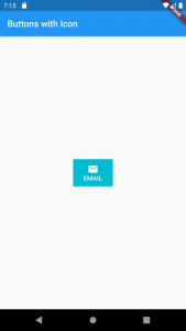
If you run the above code example in Android studio, your app will look like the one on the image below.
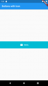
Depending on your layout requirements and in need of a horizontal layout just convert the Column to a Row and voila you have a brand new button.
import 'package:flutter/material.dart';

void main() {
  runApp(MyApp());
}

class MyApp extends StatelessWidget {
  // This widget is the root of your application.
  @override
  Widget build(BuildContext context) {
    return MaterialApp(
      title: 'Buttons With Icons',
      theme: ThemeData(
        primarySwatch: Colors.blue,
      ),
      home: MyHomePage(title: 'Buttons with Icon'),
    );
  }
}

class MyHomePage extends StatefulWidget {
  MyHomePage({Key key, this.title}) : super(key: key);
  final String title;

  @override
  _MyHomePageState createState() => _MyHomePageState();
}

class _MyHomePageState extends State<MyHomePage> {
  @override
  Widget build(BuildContext context) {
    return Scaffold(
      appBar: AppBar(
        title: Text(widget.title),
      ),
      body: Center(
        child: Column(
          mainAxisAlignment: MainAxisAlignment.center,
          children: <Widget>[
            FlatButton(
              textColor: Colors.white,
              height: 60.0,
              color: Colors.cyan,
              onPressed: () {},
              child: Row(
                mainAxisAlignment: MainAxisAlignment.center,
                children: [
                  Padding(
                    padding: const EdgeInsets.all(8.0),
                    child: Icon(Icons.email, color: Colors.white,),
                  ),
                  Text('EMAIL', )
                ],
              ),
            ),

          ],
        ),
      ),

    );
  }
}
If you run the above Flutter code example in Android studio, you will get the following output.
I hope you found this tutorial useful. If you are interested in learning Flutter, please check other Flutter tutorials on this site. Some of them have video tutorials included.
Happy learning!