When building a mobile app you have to consider that not every user can or will interact with your app the same way. Having said that, you have to consider users with disabilities and what are the ways to make your Flutter app more accessible for those users.
Implementing accessibility correctly can enhance the quality of your app, increase the number of installs and really impact how long your user is going to use your app.
In this tutorial, we will discuss Flutter’s accessibility widgets and how they work. Flutter has three components that provide accessibility support:
- Large Fonts
- Sufficient Contrast
- Screen Readers
1. Large Fonts
With age, human eyes don’t always focus as well as they do in youth. Often they will have difficulty reading the text in default size. In Flutter, text size calculations are handled automatically. The Text widget has a property called “textScaleFactor” and, put simply, the given font size gets multiplied by the “textScaleFactor” to determine the font size that is actually rendered on the screen in logical pixels.
For example, if you want the text to be 150% from the default size, then you need to set the “textScaleFactor” to 1.5. See below for code example and screenshots:
Text(
  'Accessibility',
  textScaleFactor: 1.5,
)
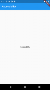
In the image below, the text is displayed with a default size.

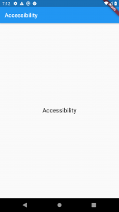
In this image, the text size is 150% of the default.

Font sizes are calculated automatically by Flutter based on the OS setting. However, as a developer, you should make sure your layout has enough room to render all its contents when the font sizes are increased. For example, you can test all parts of your app on a small-screen device configured to use the largest font setting.
One thing to keep in mind is that if you manually set the “textScaleFactor“, automatic text size calculations from the user’s accessibility settings will be overridden. So, the user’s accessibility settings won’t work anymore.
2. Sufficient Contrast
When implementing an application interface, we should specify background and foreground colors with sufficient color contrast.
A “contrast ratio” is a computation when viewing an interface on devices in extreme lighting conditions. This ratio ranges from 1 to 21 (often written as 1:1 to 21:1), where increasing numbers mean higher contrast. There are many tools available for computing the contrast ratio of two neighboring colors, so it’s a good idea to always use the resources available before publishing the app.
The W3C recommends:
- At least 4.5:1 for small text (below 18 points regular or 14 points bold)
- At least 3.0:1 for large text (18 points and above regular or 14 points and above bold)
3. Screen Readers
Screen readers are essential to enable visually impaired users to successfully use your app.
For Android, Google has included a screen reader called TalkBack. With TalkBack, users perform inputs by using gestures (e.g. swiping) or an external keyboard. Each action performed by the user triggers an audible output to let the user know their swipe was successful. It can also read the text for the user, who only has to touch a paragraph for TalkBack to begin reading it.
TalkBack can be turned on simply by pushing both volume buttons on the device for 3 seconds. It can also be toggled in the settings.
For iOS, Apple has a screen reader called VoiceOver. With VoiceOver, just like Talkback, users perform inputs with gestures. VoiceOver can be turned on by clicking the home button three times (but you need to add VoiceOver to accessibility shortcuts first), or you can toggle it in settings.
Screen Reader In Flutter
Now that we have a screen reader we can use, let’s see what happens when we run a Flutter app and check it out. I have created a simple app that has only one Text widget in the center and a Raised Button. Flutter offers us several accessibility widgets, allowing us to create a highly accessible application for all the users. The first one we’ll look at here is Semantics. Semantics annotates the widget tree with a description of its child. You can add annotations to tell a visually impaired user all kinds of things; such as what the text is if a button is selected and you can even tell the user what something will do when tapped or long pressed by using the onTap and onLongPress hints. So if we want to explain what a button will do, we can simply put a “semanticsLabel” property and add the explanation. See example code below:
import 'package:flutter/material.dart';
import 'package:flutter/cupertino.dart';

void main() {
  runApp(MyApp());
}

class MyApp extends StatelessWidget {
  @override
  Widget build(BuildContext context) {
    return MaterialApp(
      home: MyHomePage(),
    );
  }
}

class MyHomePage extends StatefulWidget {
  @override
  _MyHomePageState createState() => _MyHomePageState();
}

class _MyHomePageState extends State<MyHomePage> {
  @override
  Widget build(BuildContext context) {
    return Scaffold(
      appBar: AppBar(
        title: Text('Accessibility Example In Flutter'),
      ),
      body: Center(
        child: Column(
          mainAxisAlignment: MainAxisAlignment.spaceEvenly,
          children: [
            Text(
              'Accessibility',
              // textScaleFactor: 1.5,
            ),
            RaisedButton(onPressed: (){},child: Text('Simple Button',semanticsLabel: 'Accessibility Test',),)
          ],
        ),
      ),
    );
  }
}
As you can see in the code we have a button that has a child Text widget saying “Simple Button”. If we do not add a “semanticsLabel” the screen reader will just read the Text widget. In our case, the screen reader will read the “Accessibility Test”.
Accessibility is an important topic that should never be overlooked. We can make a lot of people’s lives easier with just a little extra effort. Since the Flutter team has already implemented Semantics in most widgets, that makes it much easier for us.
I hope this Flutter tutorial was helpful for you. If you are interested in learning Flutter, please check other Flutter tutorials on this site. Some of them have video tutorials included.